
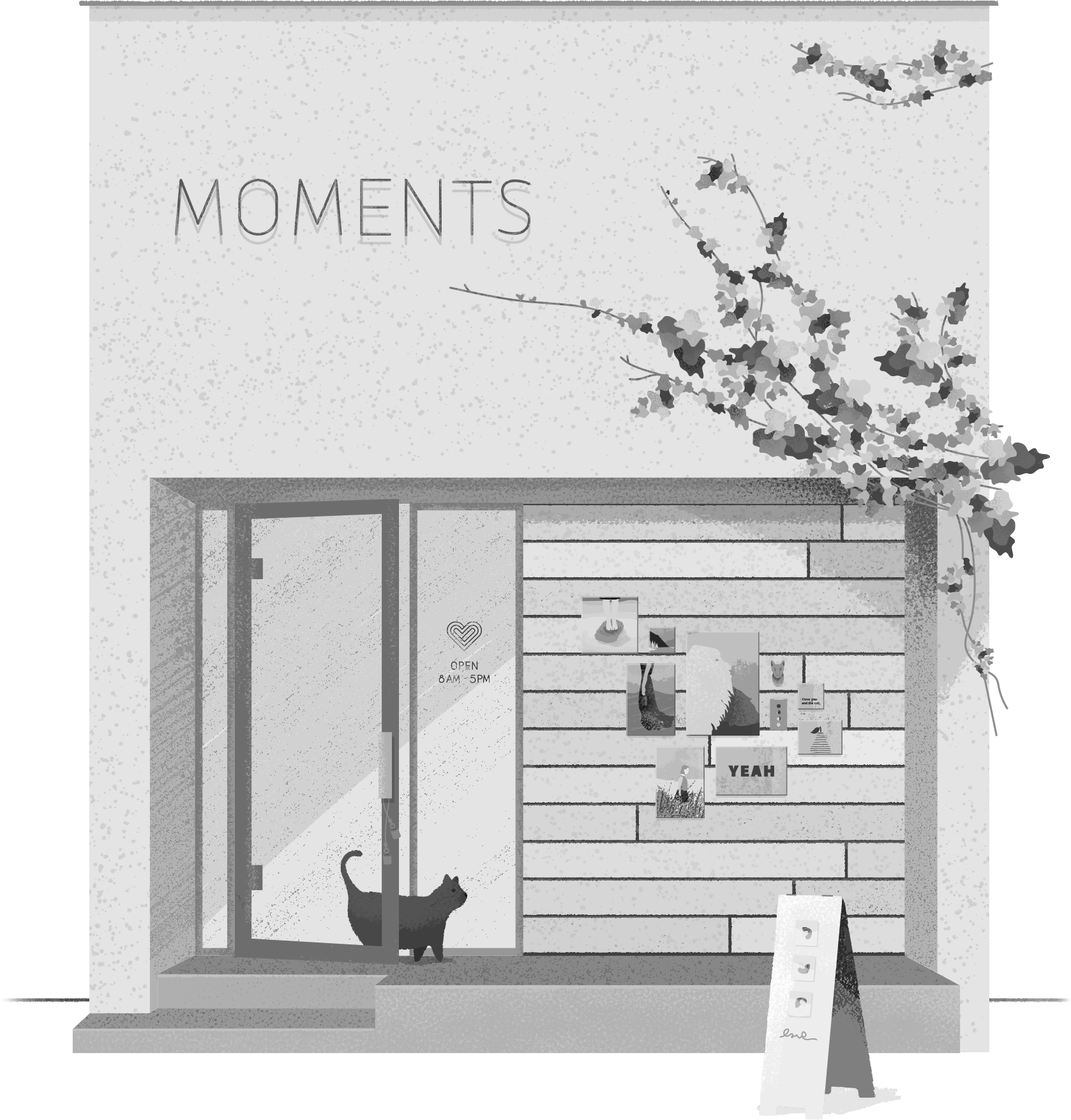
FRACTURE
Thinking beyond the frame.
As Fracture continues to innovate, they partnered with our team to help reimagine what’s possible. We worked with them to re-frame the brand from the inside out — to show what’s been there all along — an intense desire to help people uniquely share their stories in a tangible way.

REVOLUTIONIZING THE PRINTED PHOTO
We set out to craft an attitude of approachability set alongside an aesthetic that inspires people to live their best lives and transform their spaces with photography. We designed the site and brand platform with an ingrained pact of simplicity. Show — don't tell.
REVOLUTIONIZING THE PRINTED PHOTO
We set out to craft an attitude of approachability set alongside an aesthetic that inspires people to live their best lives and transform their spaces with photography. We designed the site and brand platform with an ingrained pact of simplicity. Show — don't tell.
THE TAGLINE
Focus on moments that matter.
In our initial discovery workshop with Fracture, we were inspired by the team's commitment to authenticity — that every day is filled with moments that define us. This idea started to shape every customer touchpoint as we created new content across iconography, photography, color, words, and style.
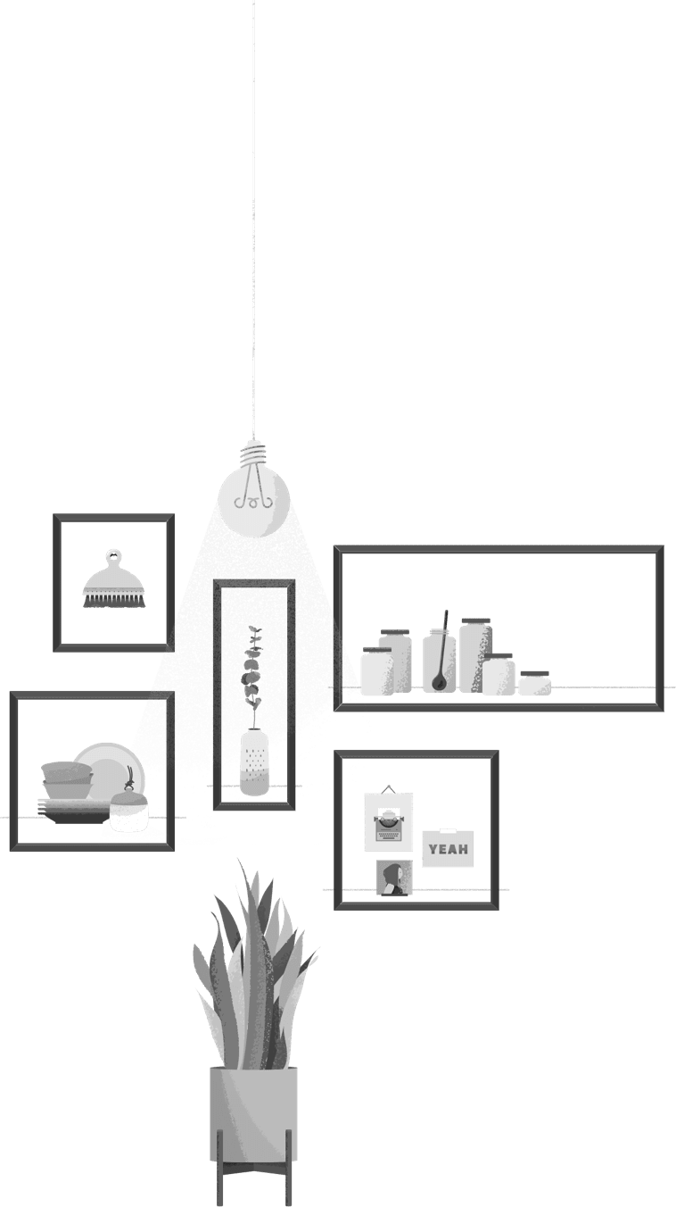
SPOT ICONS & ACCENTS
Branded iconography, used primarily in the photo uploader, brings character and color while providing action-based way-finding for customers. Custom washi patterns, used sparingly, create texture alongside photography and print mix-ins.

Washi 1

Washi 2

Washi 3

Washi 4

Washi 5
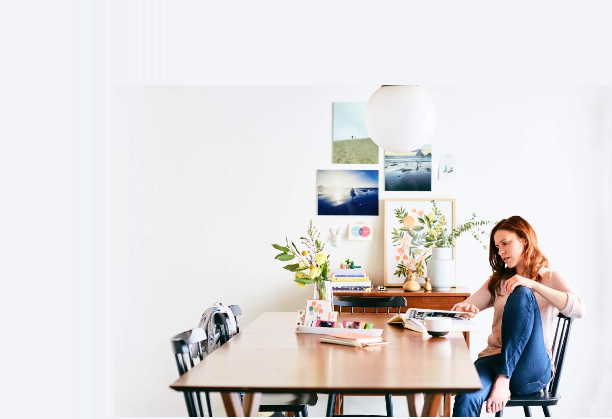
TEST PHOTOSHOOT
Once the personality was established, we kicked off a test shoot with Leah Verwey to fine-tune idiosyncrasies that would inform photography shot in-house and when working in collaboration with influencers. We were after questions such as: How much glare and reflection should show on a print? Where is the mess and clutter line? How does the product fit in with already-existing ephemera?
With each shoot, our lexicon grows. We’ve added ideas such as littles (to represent tiny collections or piles of cruft) and mix-ins (found elements that can be used adjacent to prints to create a narrative).
Commerce with intention.
When we began our work with Fracture, we took our time. We dug deep. We looked under all the rocks. We spent time with leadership, the creative and marketing teams, the production crew, customer service and spoke at length with consumers — some who had heard of Fracture, but had never made a purchase, customers who had just made their first order, and customers who keep coming back time and again to print their important moments — to inform and influence where we were heading.
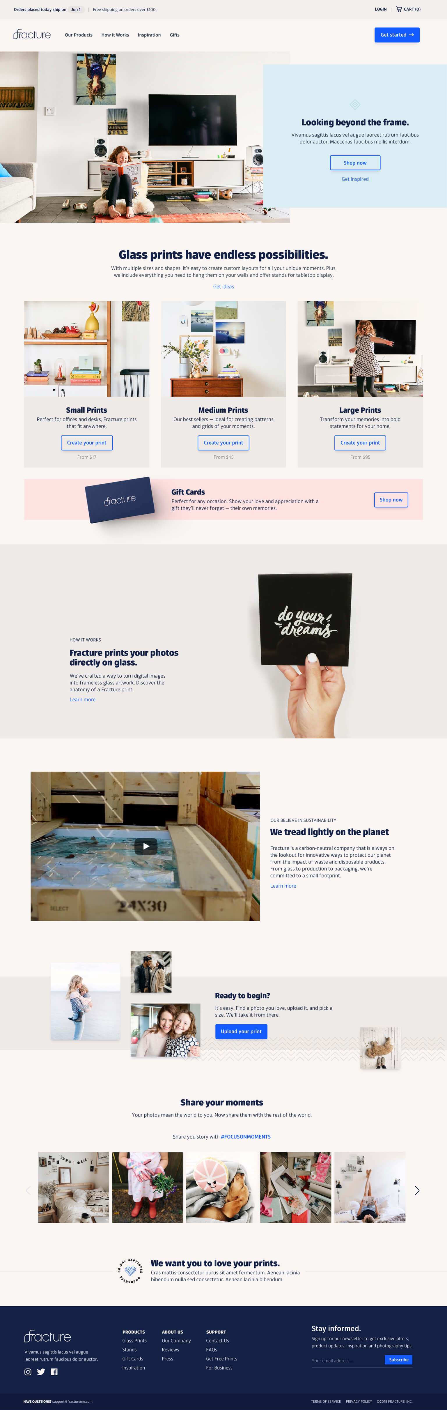
Your photo printed on glass seems straight-forward, but we found there were many questions here. How does it work? Is it truly printed directly on glass? How durable is it? How does it hang on the wall? We knew we needed to break it all down — the process, the commitment to sustainability, and how a frameless piece of art fits in with different homes and different design styles. Every touchpoint on the site was designed to inform, educate, and provide clear paths toward creating your first print. We backed this up with loads of bespoke content that introduces new customers to the product and brand. We collaborated with Sandwich to create Picture Your Life for broadcast and with TCA for a handful of direct response shorts.

BEST PRACTICES
We paired all this rich content with the latest in eCommerce best practices: showing the breadth of the product catalog, concise and direct PDPs, a fast and intuitive photo uploader, and a checkout flow that converts. See it live.
See it live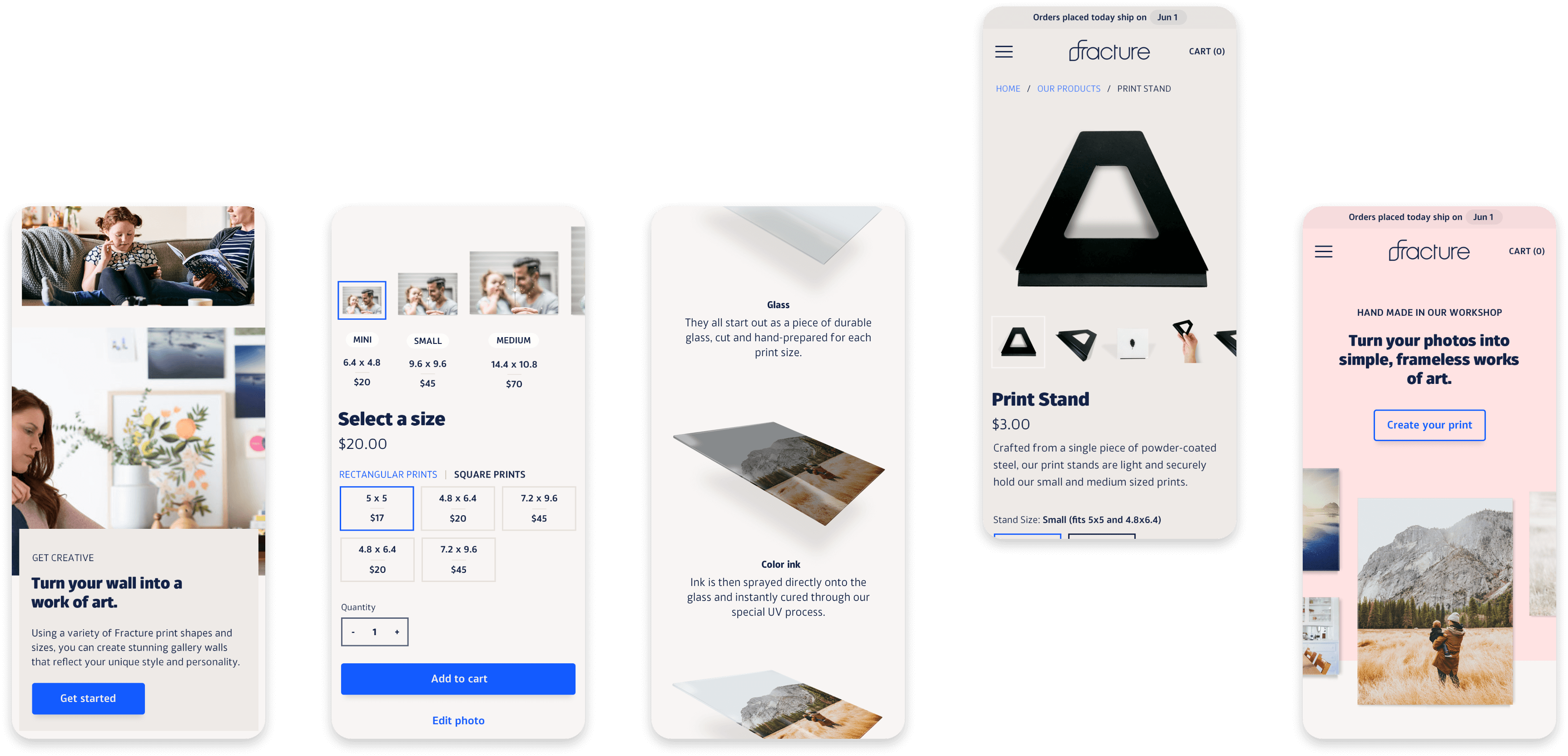
Services
Every relationship brings together loads of collaboration across teams and stakeholders. Here’s the milkshake we brought to the yard: 😂
- Brand Development
- Creative Direction & Support
- Photography
- Photo Styling
- UX/UI Design
- Visual Design
- Illustrations
- User Research